Recently a Charlotte, NC interior design client wanted to repaint a home they had just purchased. The homeowner is a do it yourself guru and insisted on doing his own paint job. When I suggested Benjamin Moore paint for the job, this couple was agreeable until they saw the price tag on the Aura brand paint that I had specified for the job. The homeowner just didn’t believe that paying that much for paint could possibly be worth it. I encouraged him to buy one quart to use on the tray ceiling drop. You can compare high quality paint to a high thread count sheet. A cotton/poly blend gets the job done and if you don’t know better, you won’t know what you are missing. If, however, you have ever slept on 1000 count Egyptian cotton sheets, you know the difference is totally worth it! I told him that if he wasn’t convinced that the paint wasn’t significantly better than what he was used to using, I would not say a word! Needless to say, he couldn’t believe how much easier the whole process was with the Benjamin Moore Aura paint. “It went on easier, like butter, and covered in one coat!” said the homeowner. He went on to paint the rest of his home in the Aura paint. Fortunately for me, he liked the paint because, what I didn’t tell him is, that other brands of paint can rarely match the Benjamin Moore colors to their fullest depth. .
Clients often call me for color consultation when it comes to choosing paint. The process of choosing involves lots of considerations. How much light is in the room, what the homeowners want in terms of warm or cool, is there a focal wall, what other colors are at play… all of these and more help narrow the field of color choices. Once we have two or three choices, I encourage clients to buy a sample pot or color sheet so that they can see it in the room in a significant amount. I advise them to observe the color in different light at different times of the day. The way that color and light interact can make a difference in the color choice. Once a selection has been made, I encourage the painter, whether a professional or do it yourselfer, to color test the paint against the sample after it has been mixed. Once, a Benjamin Moore dealer had a problem with the calibration of their color mix and the colors that we chose came out significantly off from the samples. Fortunately, we did poster sized color boards, for one last review with the client, when we noticed the flaw. Had we not tested, the color would have gone on the walls with disastrous results!
I often tell clients that painting is the least expensive way to completely change the look of a room. If you get some color advice, choose high quality paint, look at the colors in different lights, and test the final paint mix before you begin painting, you can expect a beautiful result.
Tuesday, October 27, 2009
Tuesday, October 20, 2009
To Market, To Market...
We are just back from the High Point Furniture Market in High Point, NC. This year marks the 100th anniversary of this monumental trade show. It was, as usual, spectacular! It is hard to describe to those that have never been and I always feel compelled to try. Imagine an entire downtown area, sky scrapers ( well really short ones but none the less), cubby holes, strip shopping centers and office buildings filled to the brim with the brightest and best that every vendor can offer. Ten million square feet of show with give aways, food, festivities, and transportation at your beck and call. The way the city handles the thousands upon thousands of visitors is truly remarkable!
Every season, I report on the trends that I saw at the market. This year, I actually attended a seminar that reviewed 100 years of design trends and then a 15 minute wrap up on trends that are coming. I found the presentation to be fascinating and the speaker to be right on the money with his predictions.
Every season, there are multiple trends to track and this year was no different. The two most predominate that I noticed is the story of sober versus saturated. By that, I include color, pattern, and the overall style.
On the one hand is sober. It is a trend that sort of reflects the current economy, if you will. This trend is all about a sober and serious aesthetic. Think colors called "French Rain" and "London Fog" in the gray tones. For texture; wools, slubby linen, raw silk and other natural textures. Finishes include a "french market finish" which is a light wood with sort of a greyed out whitewash that showed up at Habersham as well as smaller vendors. This look is carried off with low voltage lighting and moody wall colors and accents. This quiet and somber trend is in direct juxtaposition to the other trend that I am calling saturated.
As with current runway fashion, the home furnishing industry is inspired by the 60's and 70's and they are bringing back colors and pattern from that era in a big way. Think Kelly green and marine blue, black, white and yellow, or, pink and orange in combinations. A pop art pattern, over sized and exaggerated, finish out the look. Even some of the most traditional vendors show cased this look.
Of course there are always "sub" trends. Metallics and embellishments are still a huge presence. Think nail heads and shells, sequins, buttons and other "bling". There is still a large segment of the market dedicated to what I have come to think of as a 'green' aesthetic. Reclaimed wood and recycled materials mark this style. Natural materials, vegetable dyed or tea stained colors are shown with natural elements. For example,the use of wooden stumps turned into stools or burlap turned into drapery panels. This pared down look works when the textures are really layered into the room. This trend is kind of colorless but really soothing and appealing in its own right.
As always, there is color trends to watch. At this market besides the grey and the saturated colors of the 70's, teal was seen across the board. Teal, a purple that leans toward pink (like a wine stain on a white napkin) orange and lime green were all fighting for dominance at the show. I had a client that wanted to find some coral accents and we did not find one!
That is the wrap up on the major trends that we saw at market. In later posts, I will share some of my favorite finds!
Sunday, October 11, 2009
Artwork for your walls...
As a former art major in college, I am completely opinionated when it comes to the subject of art in the home. I have a real hard time purchasing artwork with the sole purpose of “matching” the room. Art should be personal and meaningful to the client. If you are not emotionally involved with a piece of art, it has no place on your walls! I don’t care where you find it or if it is considered “serious” art, it has to speak to you on some personal level.
When clients are doing a space, we look to see if what they already own will work. If something new is needed, I encourage them to think “locally” and support the artists in the community whose work interests them. There are art galleries, art and craft fairs, art leagues that have shows and events, and, even restaurants that showcase art work. It makes local work easy to find.
Today there are many options for wall décor. We have used mirrors, game boards, photographs, old signs, iron pieces, wall vases, shadowboxes, baskets, tapestries, textiles, architectural salvage, sports equipment, pressed tin, dried botanicals, children’s artwork, plates, platters, maps, and matchbooks. We have framed keys, doorknobs, letters, baby clothes, ballet shoes, spoons, antique certificates, pages from books, pages from calendars, mementos from trips, playbills from theaters, sports memorabilia, movie theater posters, and nautical items. There are so many options that the sky is the limit. I have even coached clients in creating their own art piece and have hung several pieces of art created by the client’s children. I encourage you to leave the commercial retail print off your shopping list when there are so many other options for the walls in your home. Have fun with your choices, be bold, shop original, create your own and the walls of your home will have a personality as unique as your own!
Subscribe to:
Posts (Atom)
Calgon Take Me Away...
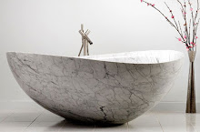
soak your troubles away in this stone beauty

Bathtub becomes fountain... fabulous!

cottage charm!

perfect for your mountain retreat!

Where I belong...
The AIDP Charlotte Chapter Board Members
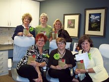
Seated from left, Davetta Moore, National Board Member, Wanda Horton, Vice President of Communication, Jane Ann Maxwell, President, standing from left to right, Nancy Martin, Vice President of Membership, Mary Santini, Secretary/Treasurer, and Marianne Parker, National Board Member
Emily's New Room


This desk was the inspiration for the room
Decorating for Christmas in Adult and Kid Zones...
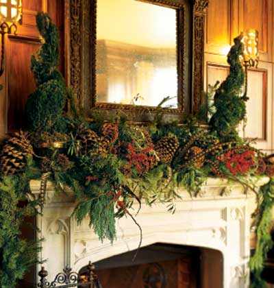
Adults will love the beauty of the luxe mantle

This bright, bold mantle is kid friendly

This lovely arrangement is sophisicated and elegant

Kids tables need centerpieces too and these serve as favors to take home afterwards!
The Holiday Table...
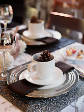
This table setting would make a beautiful Thanksgiving breakfast table

Greenery - simple and elegant
These pictures illustrate the idea of using what you love...
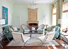
One home owner loves classic traditional decore, the other mid century modern. Look at what they created using the things they both loved!!!

Grouping beloved collections create impact

Two collections united by color
Pictures from the Coastal Vibe Project
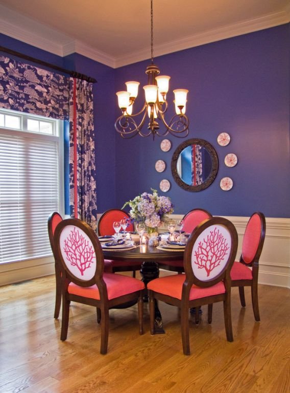
The chair fabric was designed just for this client and then made into yardage just for these chairs!

The living room seating area. The client wanted it elegant and yet relaxed, with the idea of being at a house on the beach.

We added the built-ins and had the paint changed before the homeowner moved in. A cozy seating arrangement and momentos from world travels warm the space.

another view
These pictures illustrate "staging" principles

This beautiful room was designed to be cozy and full. This room is an example of NOT staging to maximize the square footage. Thanks to House Beautiful for the image

This serene room is designed for maximum spaciousness! Notice that you see lots of floor through the legs of the coffee table. Lots of breathing room in this space. Thanks to House Beautiful for the image.
This is an example of Benjamin Moore Aura paints to go with the About Paint post

One of the many beautiful colors in the Aura collection

Aura paints have low VOC's which means it's healthier for everybody!
To illustrate the post "Art For Your Walls"
The following pictures are artwork from some of my favorite local artists. The fabulous thing about these folks is that they will do commissioned pieces especially for you! Enjoy...
Local Artists...
Richard Anderson

Celia Flock

Sany Seipert, an older work, her newer stuff is better, this was the only image I had...
The following pictures are from the October High Point Furniture Market.
These are some of the showrooms and displays that I thought were terrific.
Bella Luna was one of my favorite showrooms!
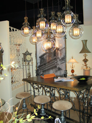
everything on display was quirky and elegant

One of my favorite finds, this mirror is a piece of art!

These sassy stools help tell the Bella Luna story

Cyan design always has unusual and neat things
Hot Color Trend shown at the Spring Market in Highpoint!
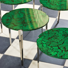
black and white and malachite!
Luxury Lighting!


Favorite New Accessoires...

Contact us for more information or to place an order...

love this!

simply elegant!

fabulous silver platters that are even better in person

These make such a great centerpiece for a dining room table
FALL MARKET 2008 - GORGEOUS COLOR, FOCUS ON "GREEN" DESIGN, FUN WITH LAQUER...
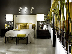
New color combo that was everywhere, butter and pewter, so pretty, soft and fresh!
Gorgeous Global Views - always my favorite venue
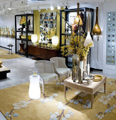
soft butter and pewter
"GREEN" in both color and sustainablity is a beautiful choice...

These pillows made from abaca leaves and coconut beads are eco-friendly and good for the workers of the developing country in which they are made.
Old favorites are still in play...

aqua, teal, peacock are still popular-- note the laquered mirror!
Before and After pictures are always fun!
This is a "before" picture of a recent project.
After #2!

Before #2
same room, different view
AFTER!
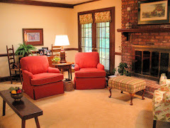
new carpet, upholstery, paint, window treatments...
More from the High Point Spring Market My Favorite Overall Venue - Global Views
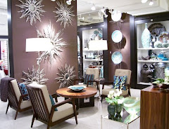
terrific accessories, uniquely displayed

black, white, red, silver punch!

note the male figures at the bottom of the ropes climbing out of the vases!
Favorite Find at the High Point Spring Market
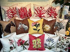
Pablo Mekis Artisan Pillows
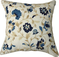
the hand stiching is fabulous!

more Pablo Mekis
A designer is as good as her team...
Every designer relies on a team of people to help execute her design vision. I have worked very hard to assemble a top notch team of craftsmen and professionals to rely on for excellence in execution and customer service. I have nick named them "The "A" Team". This name is so appropriate because this group brings their best effort to each task. There are many folks out there that will give you adequate, we strive for exceptional.
The following pictures will introduce you to some of the work done by these guys...
The following pictures will introduce you to some of the work done by these guys...
Introducing...
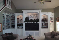
Heavin Woodworks - beautiful trims and built-ins
Introducing...
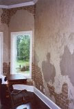
G.Richard Anderson Faux Finisher. He does fabulous work!
Oeco Textiles
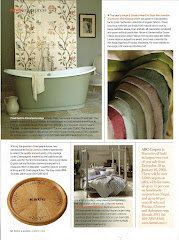
all natural and all green
A staged breakfast room
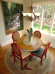
We recovered the chairs to co-ordinate with the area rug and added a fresh bunch of flower from the grocery store!
This week...
This week, I am working on two interiors that are either on or are near Lake Wylie, SC. Both homeowners are interested in incorporating a coastal "vibe" into the design for their homes. Working on two homes with the same design direction has never happened in my business before. It will be fun to see just how differently we approach each home. They will be as different and unique as their homeowners and we will be sure to include some after pictures in about 3 or 4 months!
Something's Gotta Give
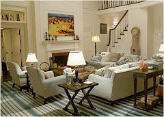
from the movie "Something's Gotta Give" the set design for the Nantucket living room is inspiration for a coastal interior that I'm working on right now...
Coastal Inspiration
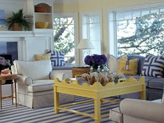
another coastal inspiration

this rug from Aspen Carpet Designs is very close to the one in the movie!


BVI's Virgin Gorda - beautiful!

great garden bench

